
Role
Entire product design from research to conception, visualization and testing
Product
A mobile app supporting non-plastic bag movement
Tools
Adobe Photoshop, InDesign, XD, Figma, paper and pencil
1. Objectives
In Finland, 860 million plastic bags were used in 2018, which were 90 million less than the year before. The recycling numbers are also considerably high, with an increasing percentage in recent years. (Yle 2020.)
Plastics itself have an intense and extremely high carbon footprint life cycle. From the very first stage of extraction and distillation from resins and fossil fuel to when recycling, incinerating or composting, it takes up a significant amount of energy and carbon dioxide discharged.
However, alternative solutions are not providing much better scenarios. When it comes to the number of materials including electricity, water, the fuel needed for producing, paper packaging does take more space than plastic. The term “reusing” then has the opportunity to create positive outcomes in the scene.
2. Insights
Belonging to the Waste Hierarchy chart, Reuse comes second after the Reduce/ Prevention in priority in waste management that brings benefits to the environment. It means before considering the recycling procedure, reusing should be taken into account.
Describing as “checking, cleaning, repairing, refurbishing, whole items or spare parts”, reusing helps saving energy and money to produce new material, which also leads to zero waste being discharged into the climate.
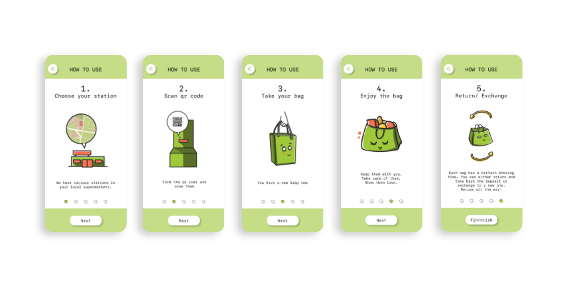
Digital products in a mobile platform is a great way to connect people and communicate positive messages. PICBAG is an application that allows people to track down and collect textile bags from different stations in local supermarkets.
The primary purpose of the product is not to stop the plastic bag usage in everyday life, but rather to emphasize the sharing process between citizens and reusing textile shopping bags. It's also acts as a new way of supporting sustainable living and courage a sharing system in local community.
3. Design process
Qualitative research: Several methods was used to identify and develop the app's content and its goals, including an one-on-one interview with Granström Mari, Chief Science Activist, and Founder of “Plastic Bag Free Kerava”, which was a huge inspiration as well as an informative source to get insights of the non-plastic bags movement in Finland. Different Personas and User Journey Map were also created based on the potential groups of customer for better understanding of the user's purpose and their usage habit.
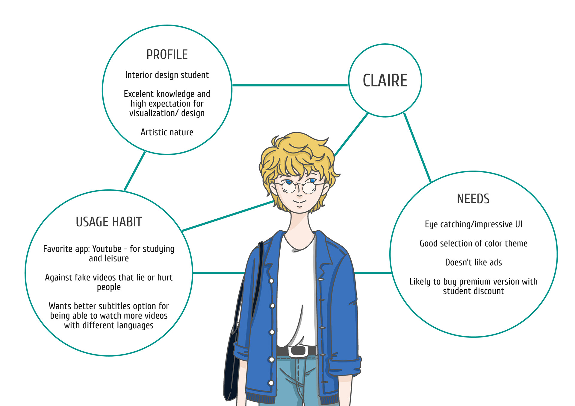
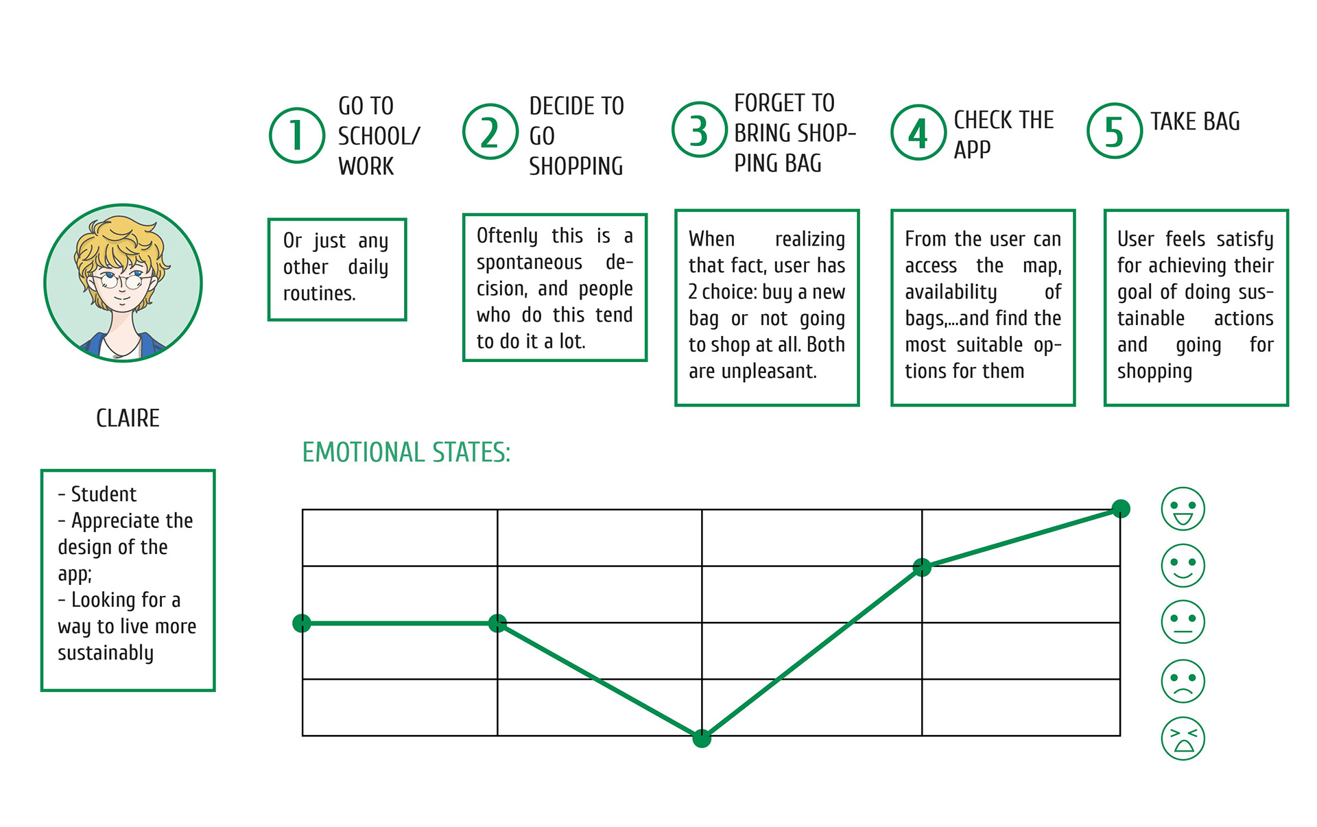
Persona and User Journey Map
Information architecture: having a bunch of ideas and features for the app in my hand, I decided to list them out and group them together based on the similarity in functions. They appeared as something like a Cards Sorting chart, which then was put into a Sitemap in order. The journey when using the app was getting a lot clearer, at the point that I finally have a decent vision of how the app would actually be like. For a better and easier imagination, I visualized them altogether into a User Flow. Prototype-ish phone screens are now presenting all the necessary steps to use PicBag.
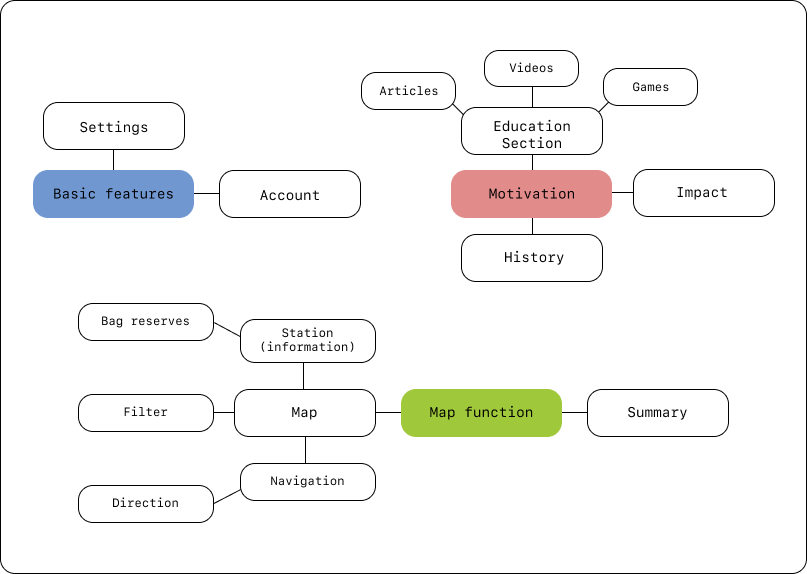
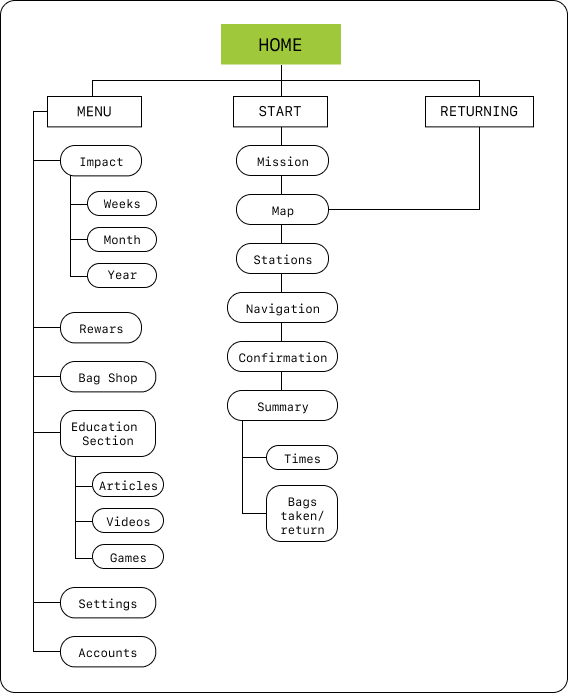
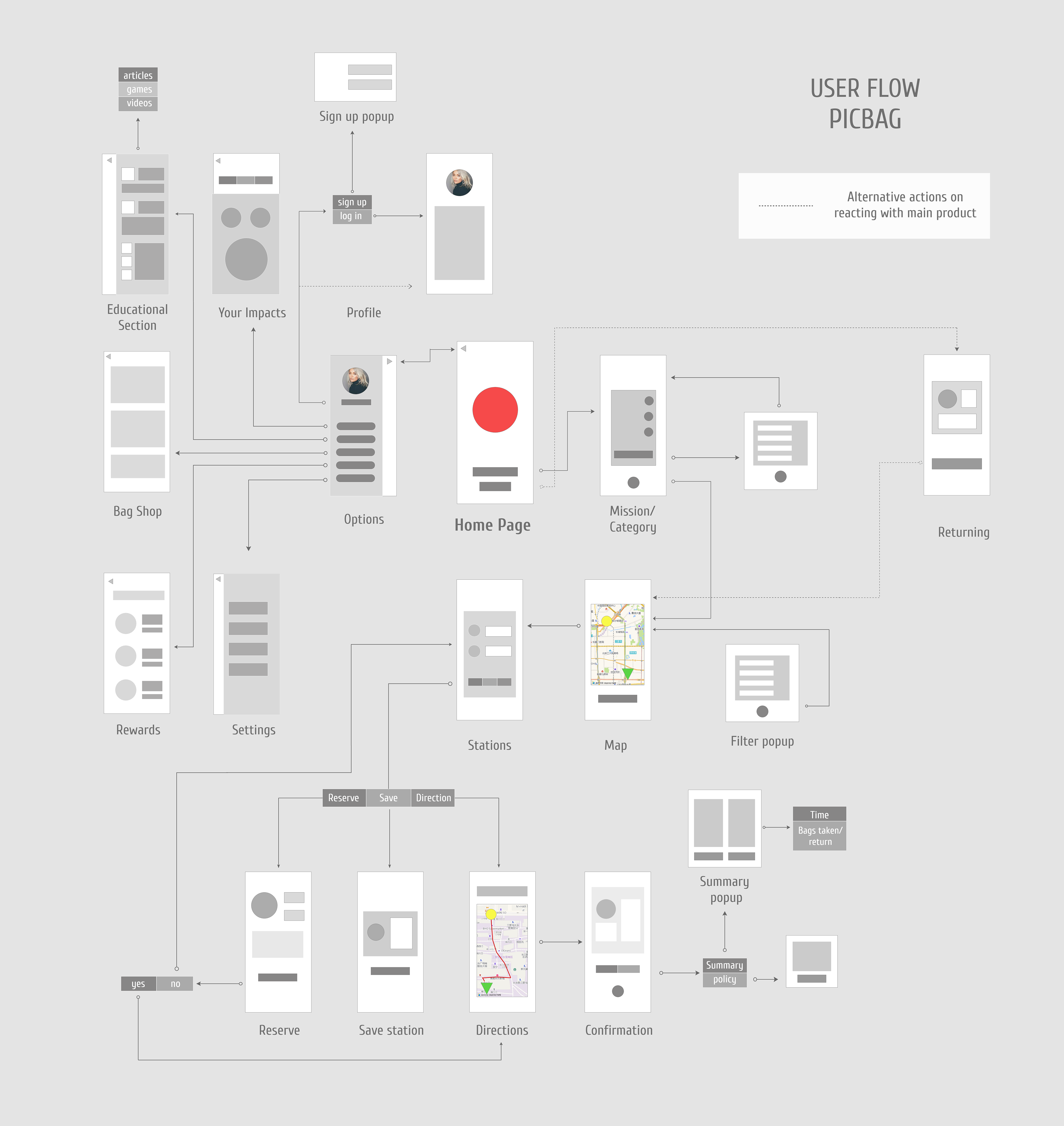
Navigation backbone/ Cards Sorting, Sitemap and User Flow
Wireframing: Even more detailed version of the Use Flow was visualized for certain screens. With specific icons and shapes, the actual look and structure of the application was coming to life.
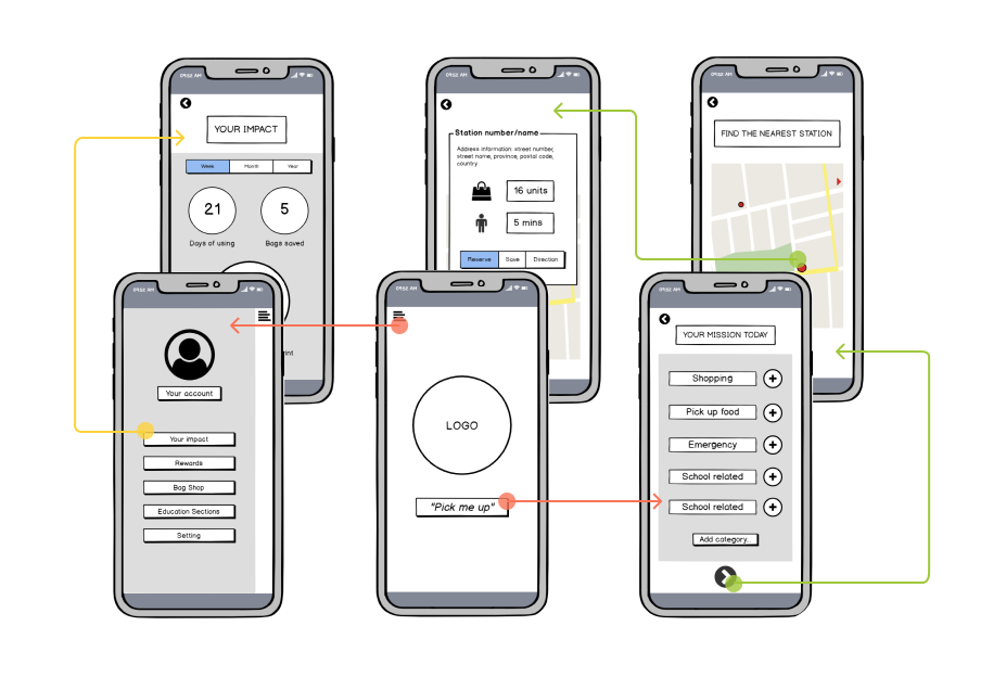
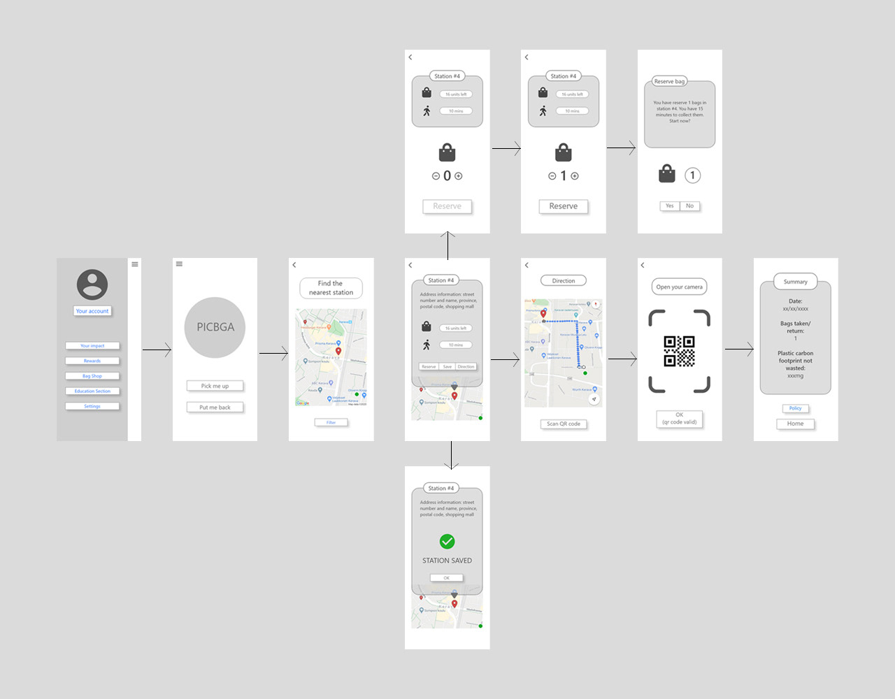
1st wireframes (left) and improvised version (right)
UI Design: To match the strong graphic and gamification style of the logo, Righteous font was used for the name "PicBag" for its thick lines and squared corner. The rest of the app's UI are in SF Mono, which provides a simple and delicate impression.
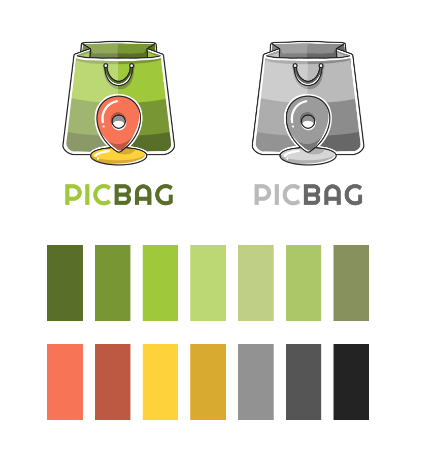

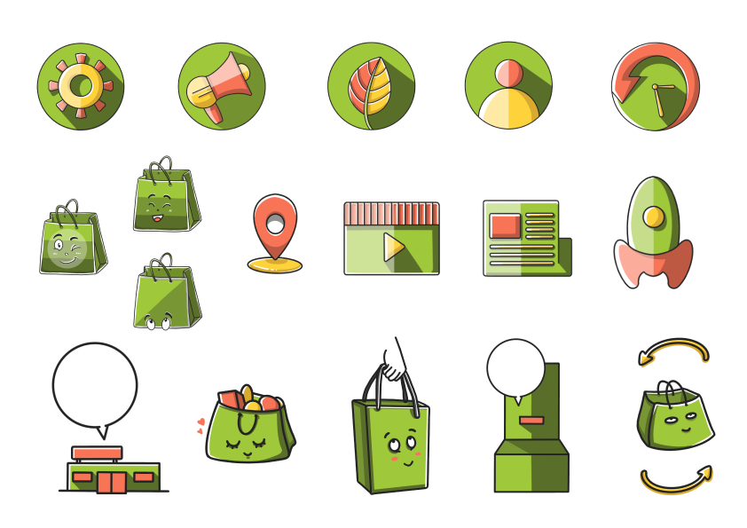
Visualization of the app's logo, icons and storyboard
4. Challenges & What I've Learnt
Having too much freedom: Weird, no? Apart from some advices from my supervisor, I worked alone in this project and sometimes too many ideas and possibilities came at once. It took quite a lot of time especially for a perfectionist like me to decide and choose between options. As some kind of solution, I seeked feedbacks and reviews from my friends and family, both from within and without the design field.
Red and green combination may not be the best choice: especially for people that have certain levels of Deuteranopia. The app's themed colors can be improved with more accessibility and accuracy.

User Testing was conducted for the final interactive prototype
Gamification design may not be for everyone: when receiving User Testing feedbacks for the final interactive prototypes, a 10% of them stated that they would like the app in less "childish" and elegant style. While the gamification UI style was chosen based on the target audience demographic, it could be consider more thoroughly from the aspects of usability and aesthetic.